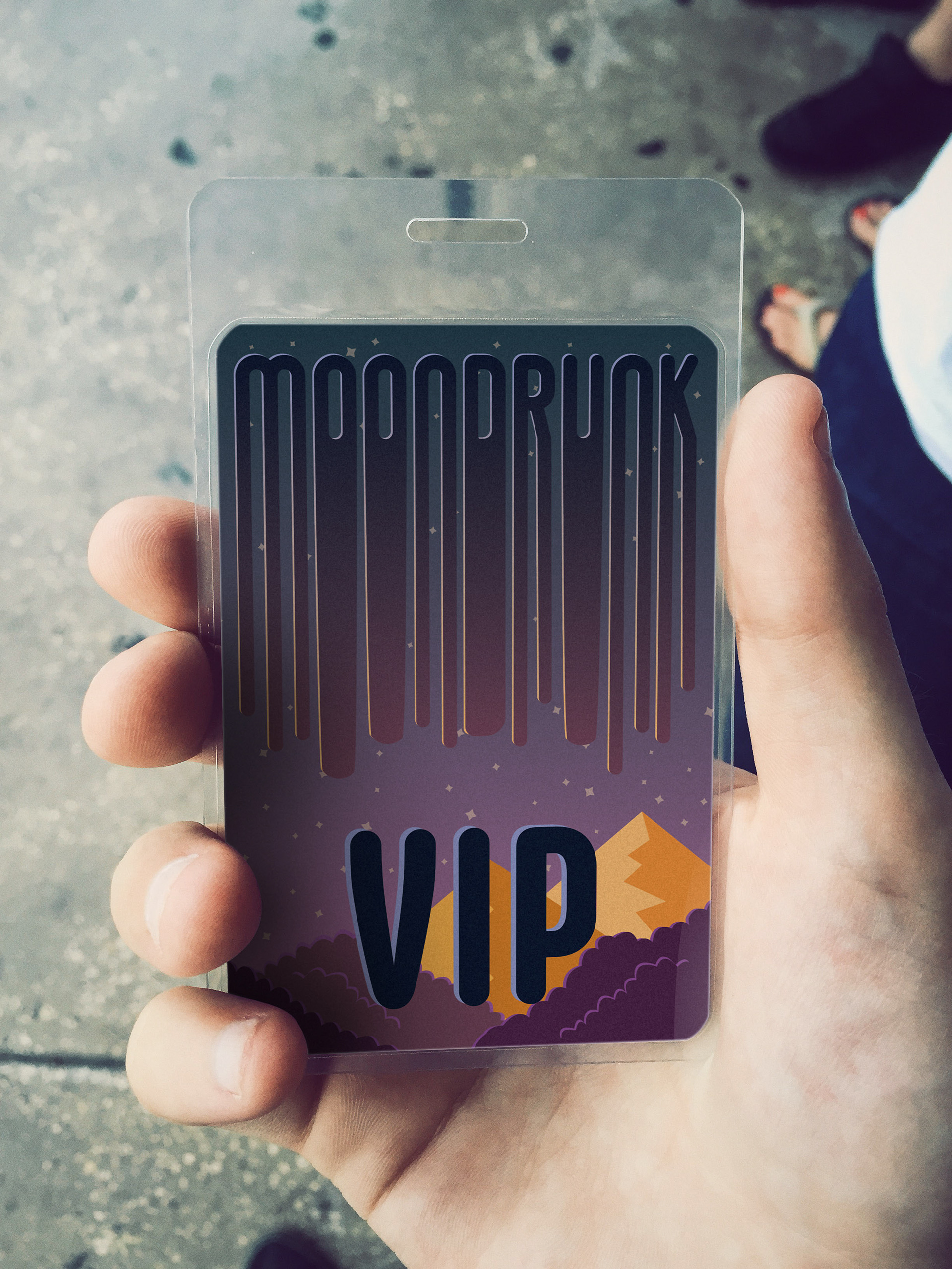
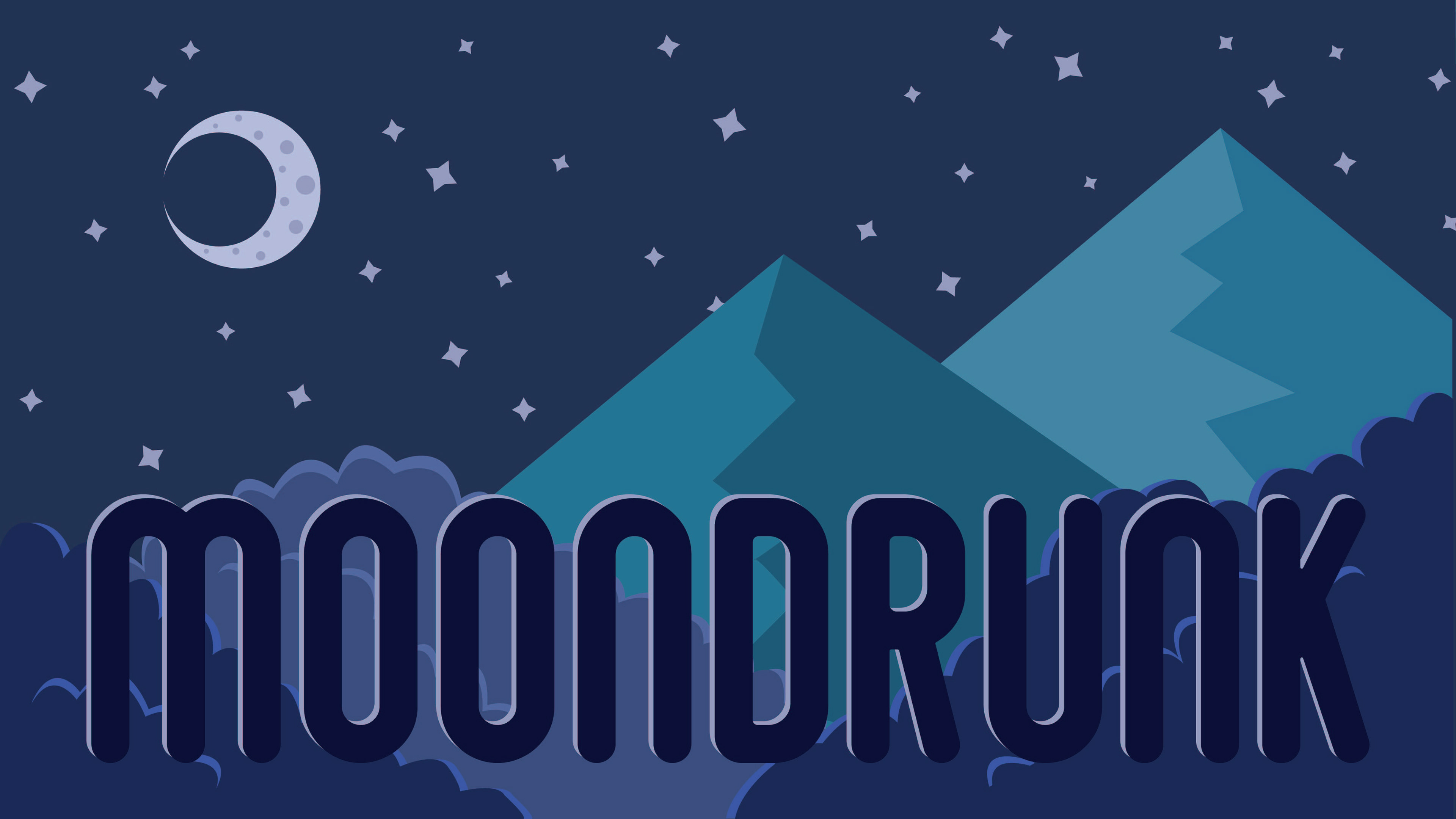
Moon Drunk started as a scenic type inspired by a poem from Twitter, but I have since reworked the typography into the brand of a fictitious summer concert.
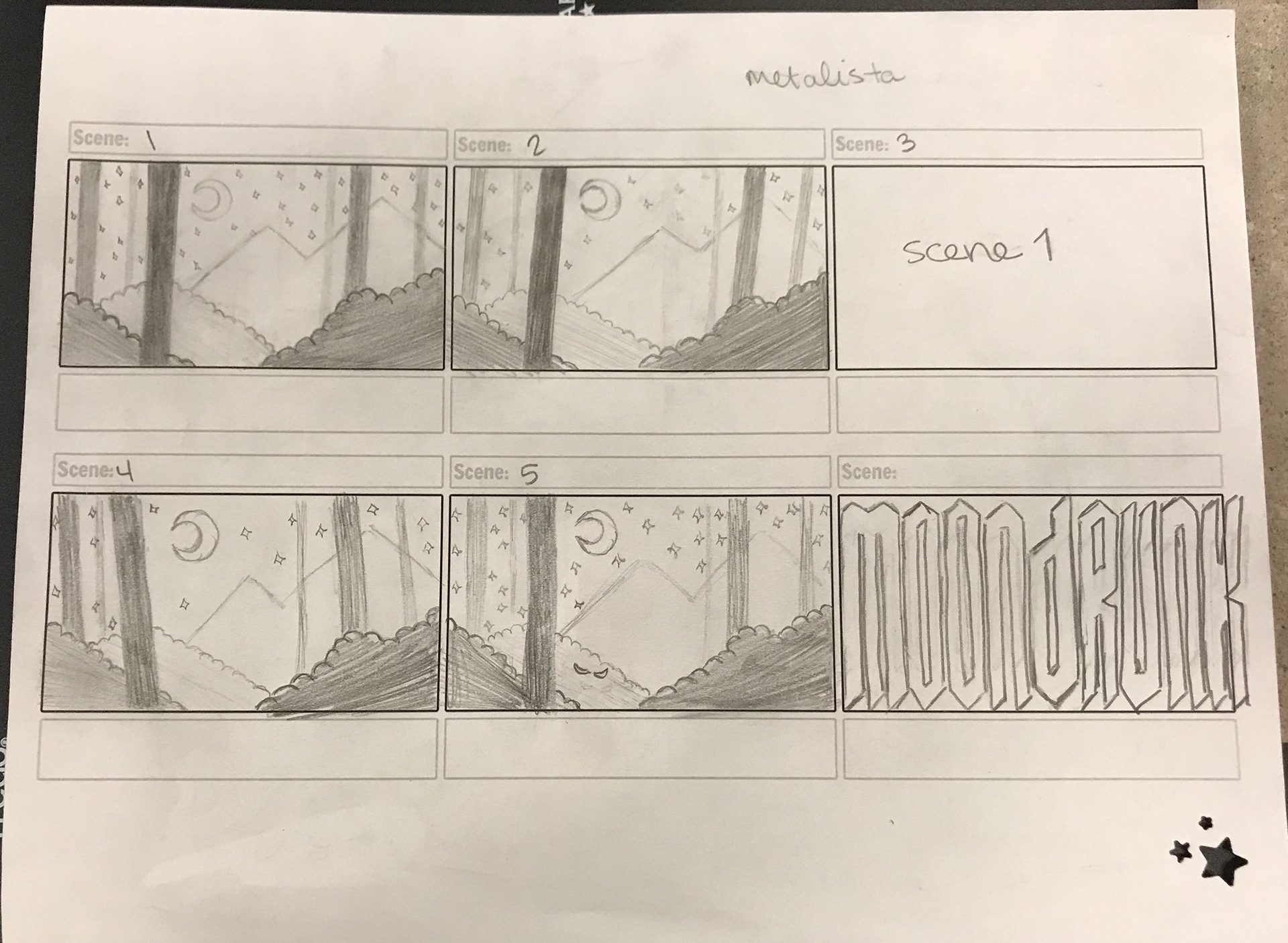
The storyboards and concept art behind the original scenic type animation.
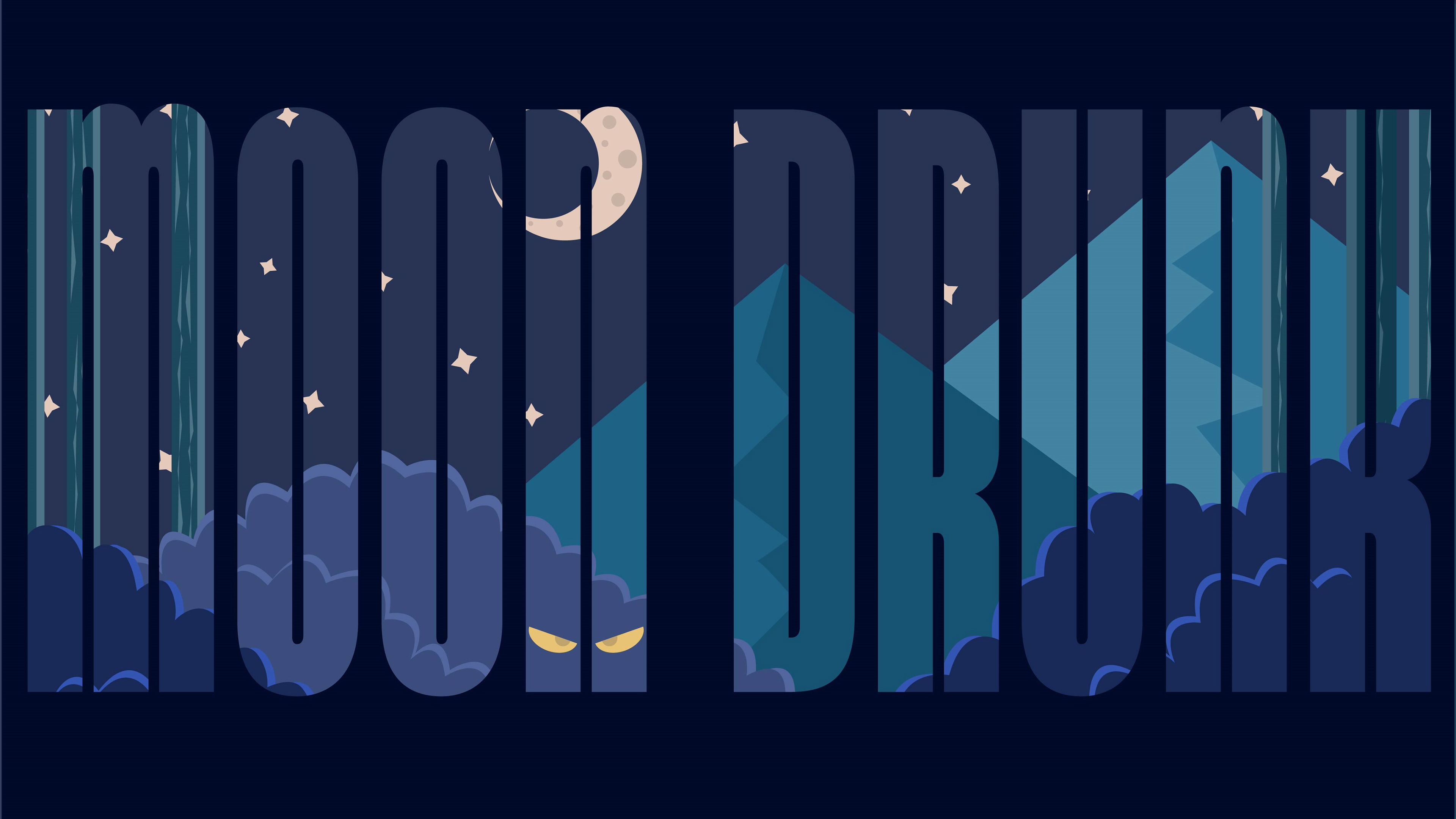
I loved the concept and the imagery that is in this graphic, but I knew I could take it to the next level.
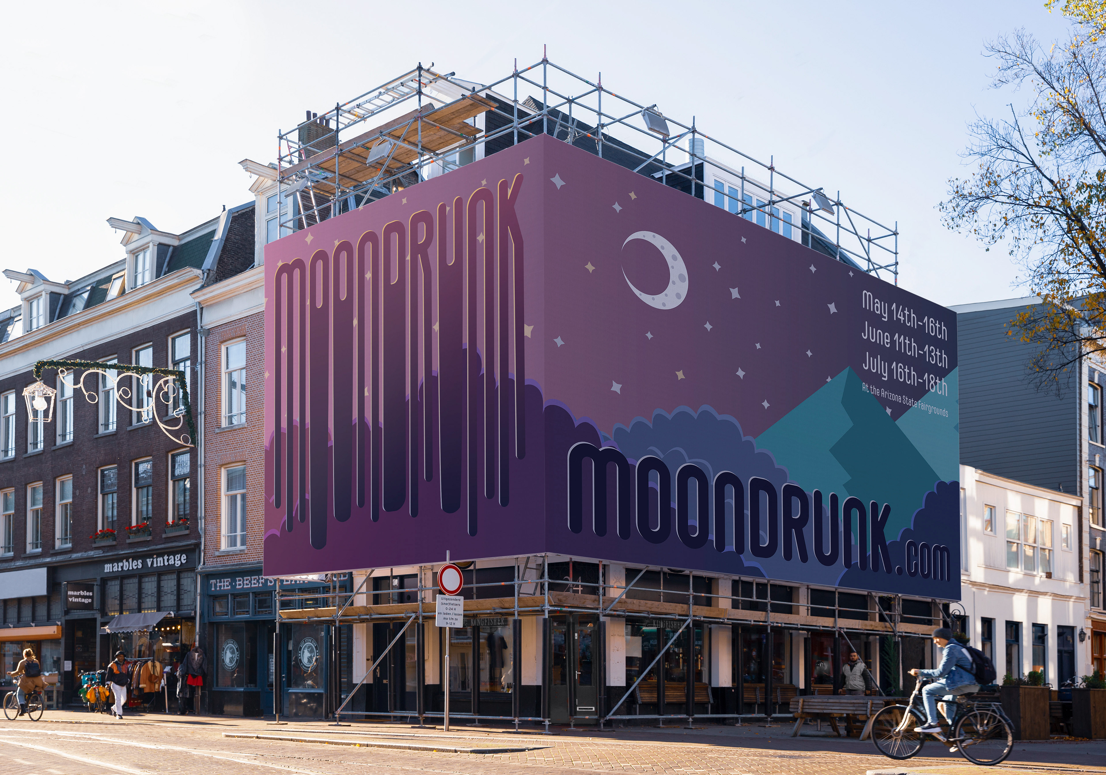
I wanted to give the typography and branding some personality and a more modern feel, so I played with different typefaces and rounded the edges. I also softened the original color palette to elicit more dream-like vibes. Once I was happy with the new look I created the drip effect to make a versatile, eye-catching graphic.
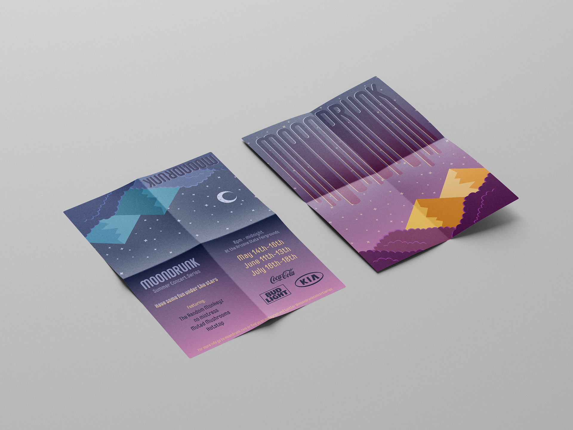

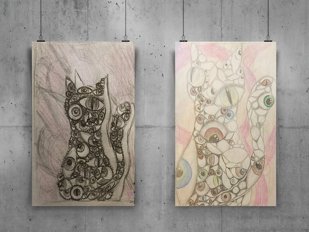
Sustainability is always something that I take into consideration, so when I was working on a take-away pamphlet/flyer I made the flip-side a collectable poster.