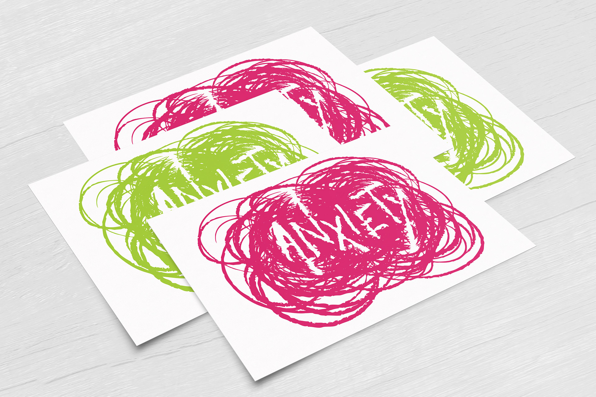
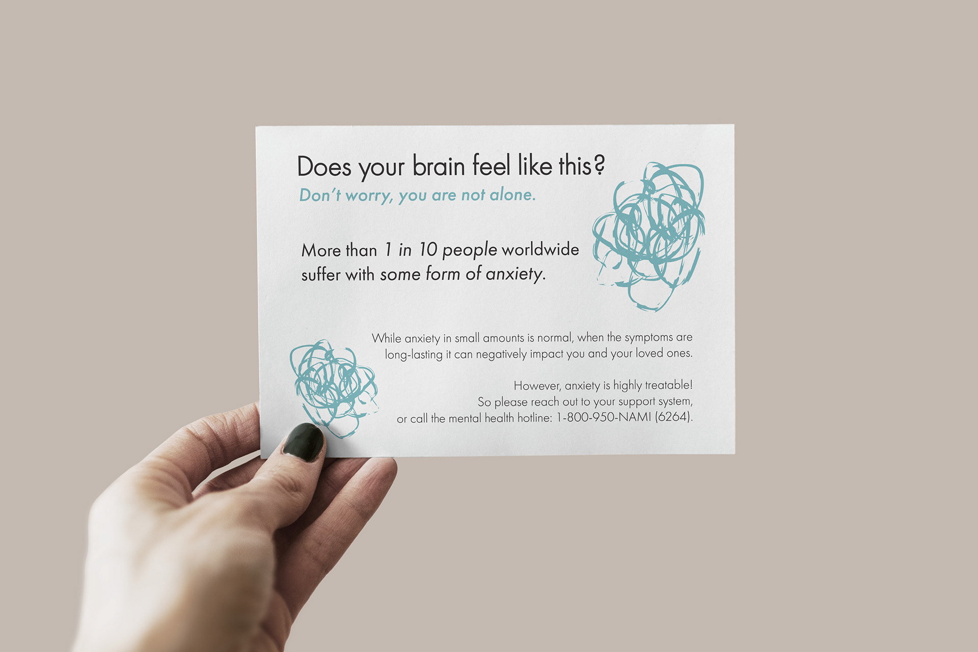
While going through my own mental health journey, I wanted a way to visually represent how it feels so my friends and family could better understand. I learned how common it is for people to suffer from some sort of anxiety and that a lot of people don't seek help!
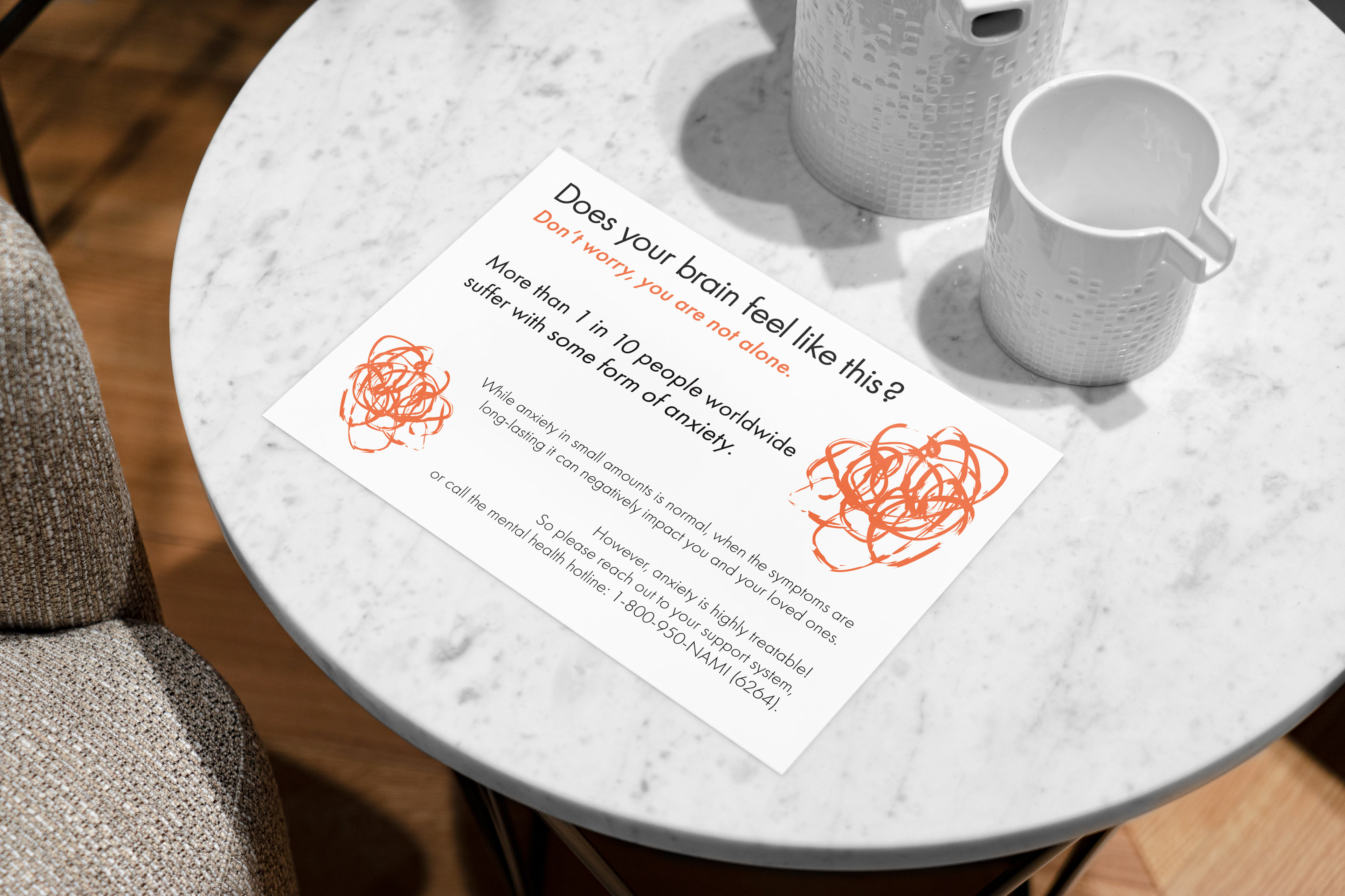
This project combines my graphic representation of anxiety with helpful information to spread awareness and to hopefully normalize getting help.
Playing with color was important to me because I feel like a lot of existing media surrounding anxiety and mental health in general has one of three color palettes: primary colors (like for kindergartener's), muted green/blue/purple (meant to be soothing, but easily looked over), or greys (to represent how it feels, I guess?)
I wanted my handout cards to be eye-catching, bright, and fun to look at because feeling like people "baby" you sucks. It is a very mature thing to realize that "you are not okay" is an okay thing and that it is in fact normal, so I wanted the colors to match that.
